


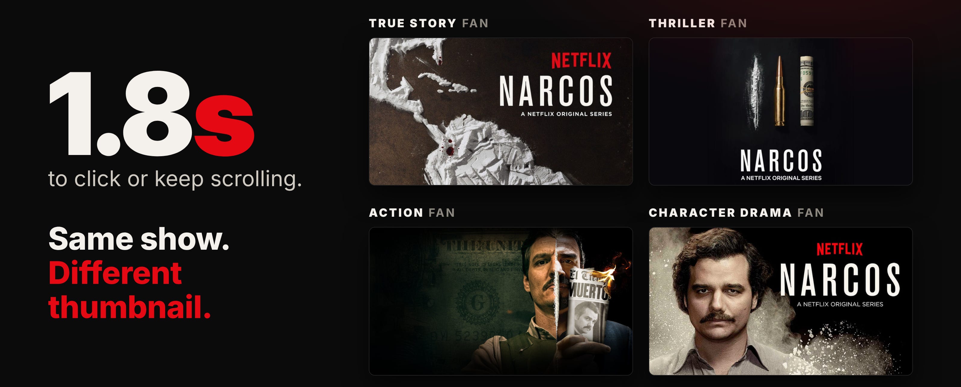
Netflix gets 1.8 seconds.
That’s how long someone takes to decide whether to click a title or keep scrolling.
So Netflix obsesses over thumbnails.
Dozens of variants for every show, tested against each other, different images served to different people.
One change can shift clicks by 20 to 30%.
The reason is simple. If the thumbnail doesn’t instantly say this is for you, people assume it isn’t, and they’re gone.
Your hero section works the same way.
The hero section is the first thing someone sees when they land on your page, before they scroll. It’s usually a headline, a line underneath it, an image, and a button.
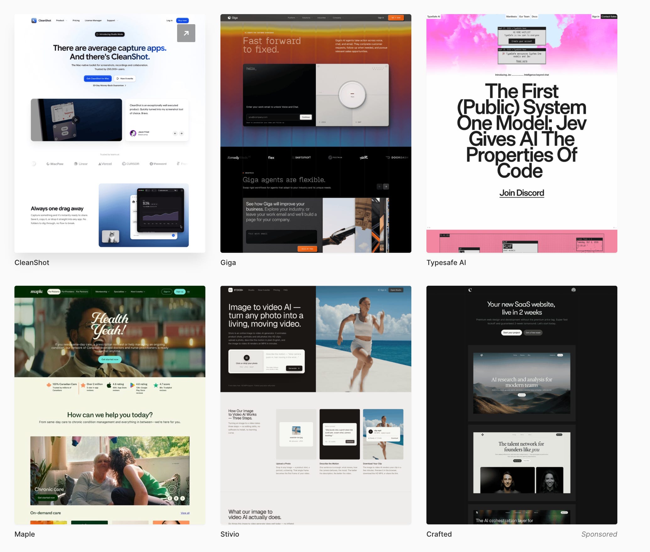
So the hero section works the same way Netflix works with their thumbnails.
You get about five seconds before someone decides whether they’re in the right place.
Miss it and there’s no scroll, no conversion, and no second chance.
Most people think the fix is better design. Flashier visuals, more copy, a nicer animation.
After building hundreds of hero sections over the last decade, I’ve found the opposite. The ones that convert aren’t the most creative. They’re the clearest.
They do one job in the first five seconds: show the visitor they’re in the right place.
Here’s the four-part system I use, and three ways to check whether yours is working.
1. The headline
The most important part of your entire landing page.
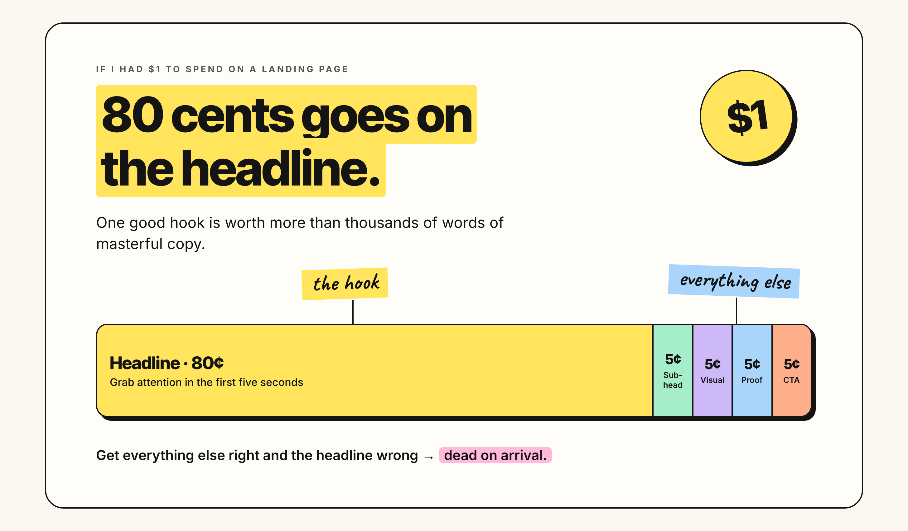
If I had a one dollar budget, I’d spend 80 cents here. One good hook is worth more than thousands of words of masterful copy, because if you can’t grab attention in the first five seconds, nothing after it matters.
You get one shot when someone lands. You have their attention for a few seconds at most.
And plenty of other people are competing for the same seconds.
Get everything else right and the headline wrong, and the page is dead on arrival.
The 4 Us.
These are four questions your reader asks without realising they’re asking them.
Urgent. Why should I pay attention right now? No urgency and they scroll. It doesn’t have to be time-based. Situational works: “Are you losing customers to slow load times?” creates urgency because if the answer’s yes, they need it fixed now.
Unique. What makes this different from the last ten things I’ve seen? If it feels familiar, their brain filters it out. This is where most headlines die. “Email marketing made simple” could be anyone.
Ultra-specific. Who is this for, and what exact problem does it solve? Vague headlines get ignored. Specific ones feel personal. “Grow your business faster” says nothing to anyone.
Useful. If I give you my attention, what do I get? How does my life or business improve? The benefit, not the feature.
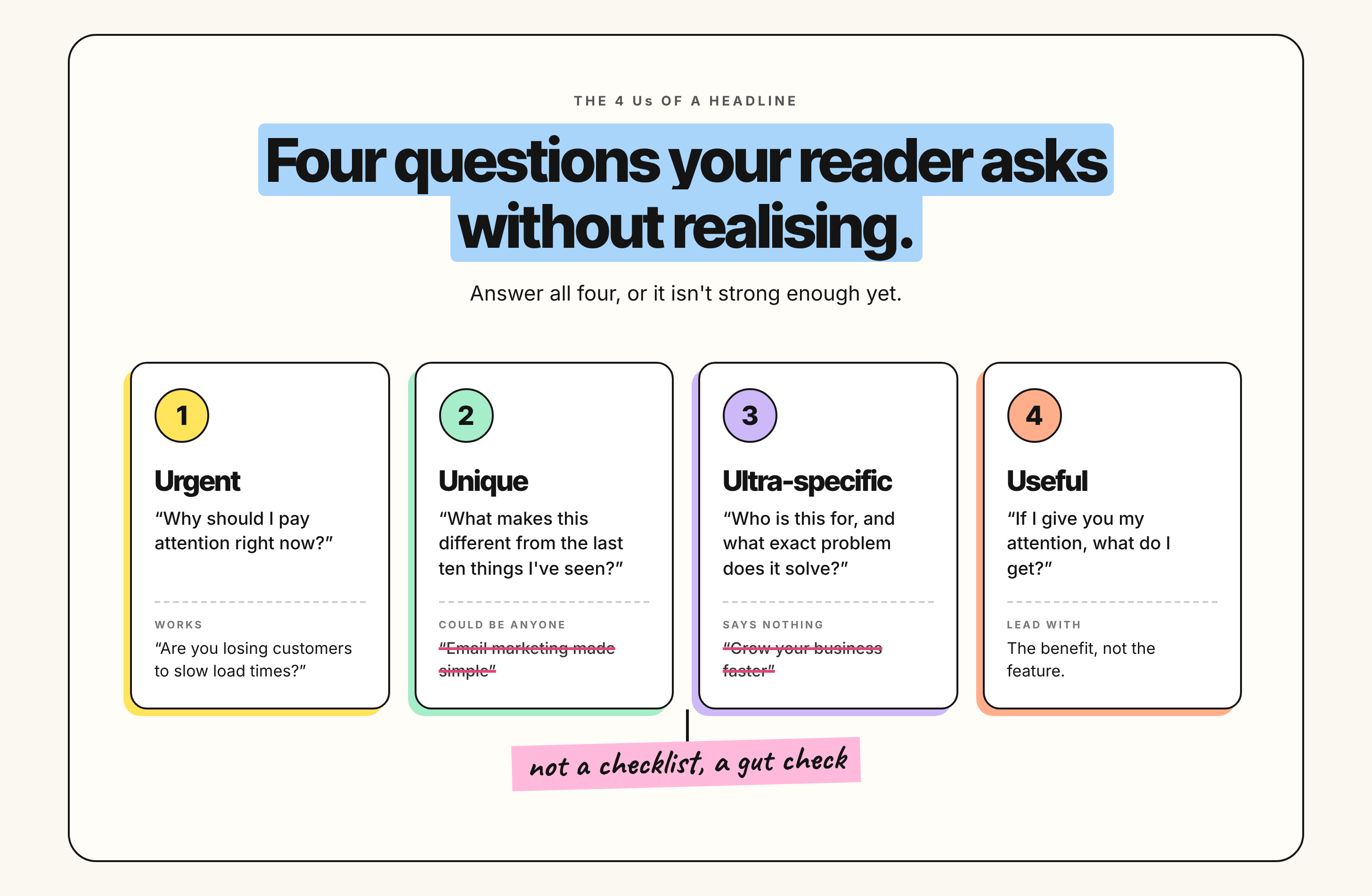
If your headline doesn’t answer all four, it isn’t strong enough yet.
Would you stop scrolling for it? If not, rewrite it.
And for what it’s worth, after writing dozens and dozens of these, it’s still hard. It doesn’t get easy, you just get faster at knowing when it’s wrong.
2. The subheadline
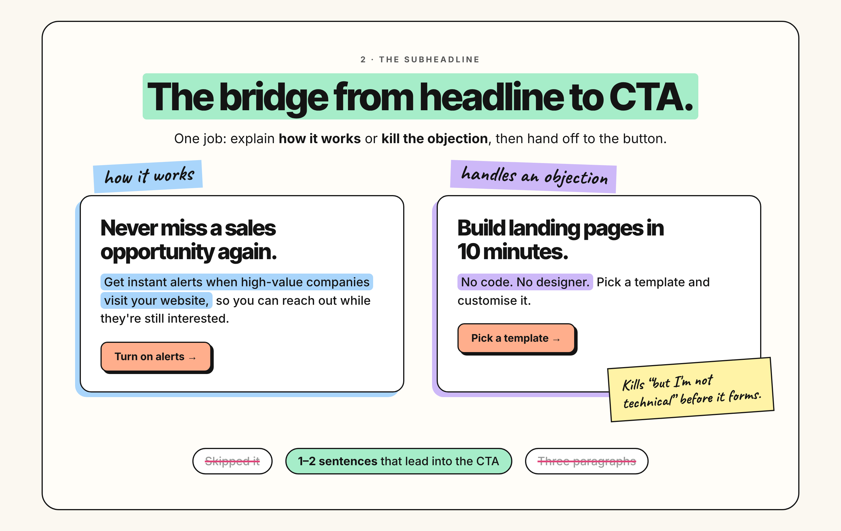
One job: elaborate on the headline and tee up the CTA. It’s the bridge between the two.
Most people either skip it or write three paragraphs.
It should answer how does this work, or what makes this possible.
Headline: Never miss a sales opportunity again
Subheadline: Get instant alerts when high-value companies visit your website, so you can reach out while they’re still interested.
That clarifies how the headline gets delivered.
Or it handles an objection:
Headline: Build landing pages in 10 minutes
Subheadline: No code. No designer. Pick a template and customise it.
That one kills “but I’m not technical” before it forms.
One or two sentences. And make sure it leads into the CTA rather than just sitting there.
3. The visual
Your hero image isn’t decoration. It’s doing work.
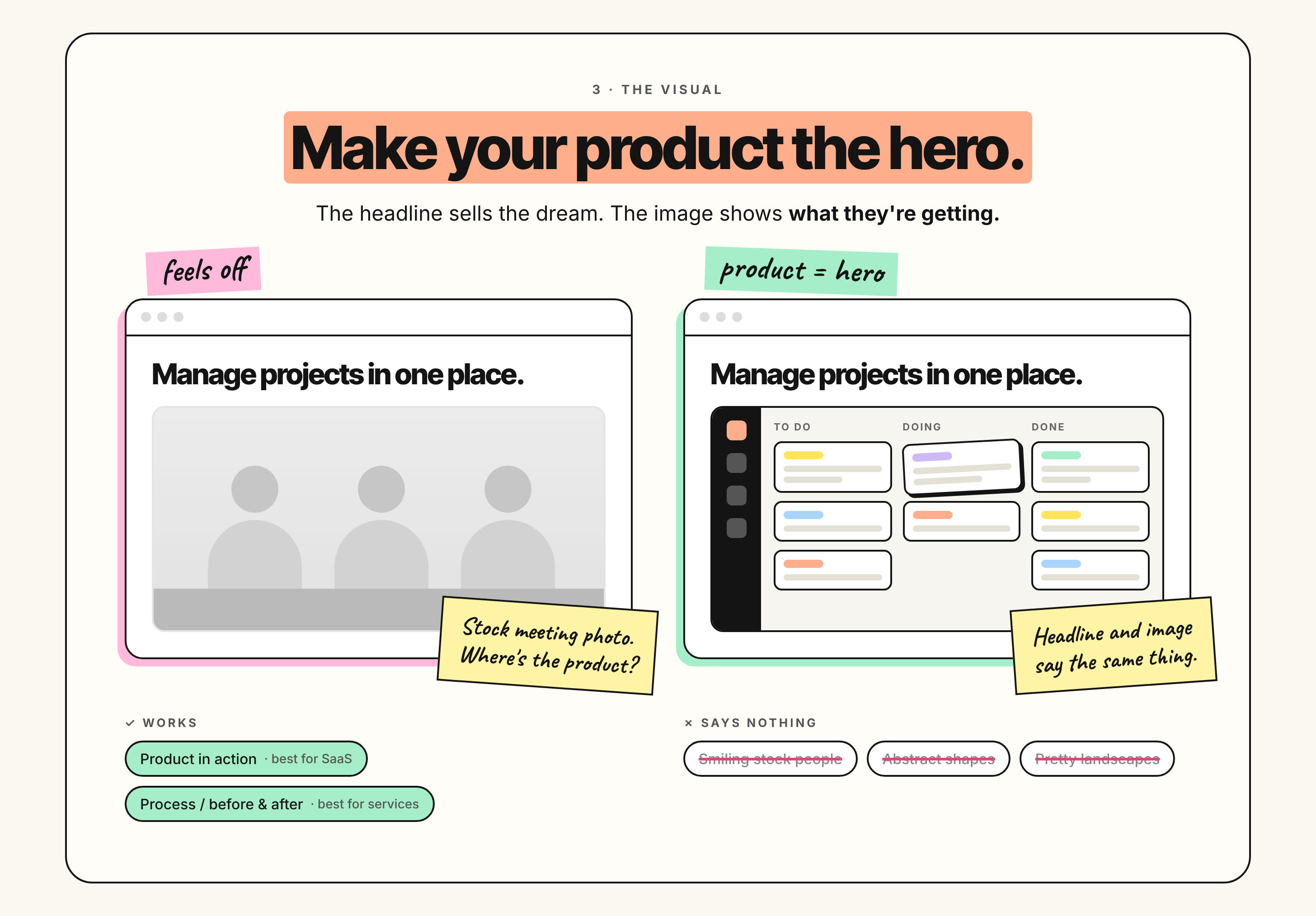
The principle that matters most: make your product the hero.
I see so many landing pages with beautiful landscape shots, lifestyle photography, abstract graphics, all trying to sell the dream outcome.
That’s the headline’s job. The image has a different one.
Show the product, the service, or the process, as the most prominent thing on screen. People need to see what they’re getting.
If your headline says “manage projects in one place” and your image is a stock photo of people in a meeting, there’s a gap, and the visitor feels it even if they can’t name it.
Show the dashboard. Show the interface. Show it being used.
Two things that work:
Product in action. The interface, the dashboard, the tool being used. Best for SaaS.
Process visualisation. The steps, the transformation, the before and after. Best for services and agencies.
Three things that don’t:
Generic stock photos of people smiling. Abstract shapes with no context. Landscapes that look nice and say nothing.
4. The next step
Your CTA is the last piece, and one thing separates a strong one from a weak one: clarity.
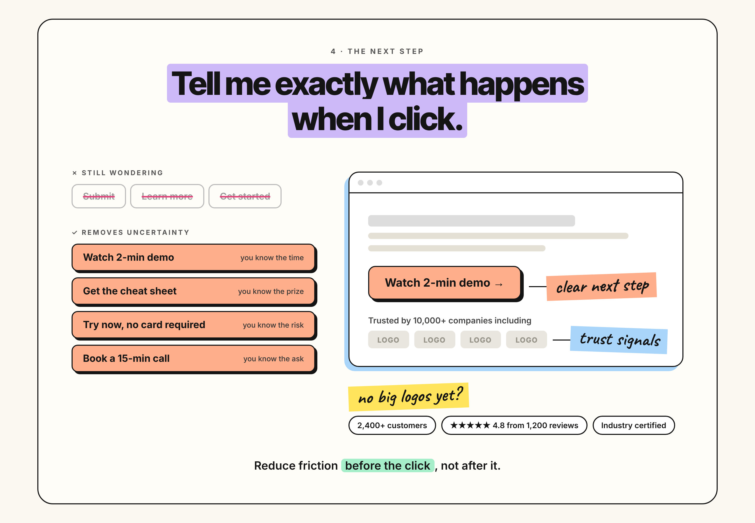
It should tell me exactly what happens when I click.
Watch 2-min demo. Get the cheat sheet. Try now, no card required. Book a 15-min call.
Each of those removes uncertainty. I know what I’m getting and what I’m agreeing to.
The rule: if someone reads your CTA and still wonders what happens next, rewrite it.
Then add trust signals. Underneath the button, logos of recognisable customers or trust badges. “Trusted by 10,000+ companies including [logo] [logo] [logo].”
Credibility without extra copy.
No big logos yet? Use the number of customers, a star rating with review count from a review site, or an industry certification.
The goal is reducing friction before the click, not after it.
How to know if it’s working
That’s the framework. Now the part most people skip.
The one-second test
The fastest way to find out.
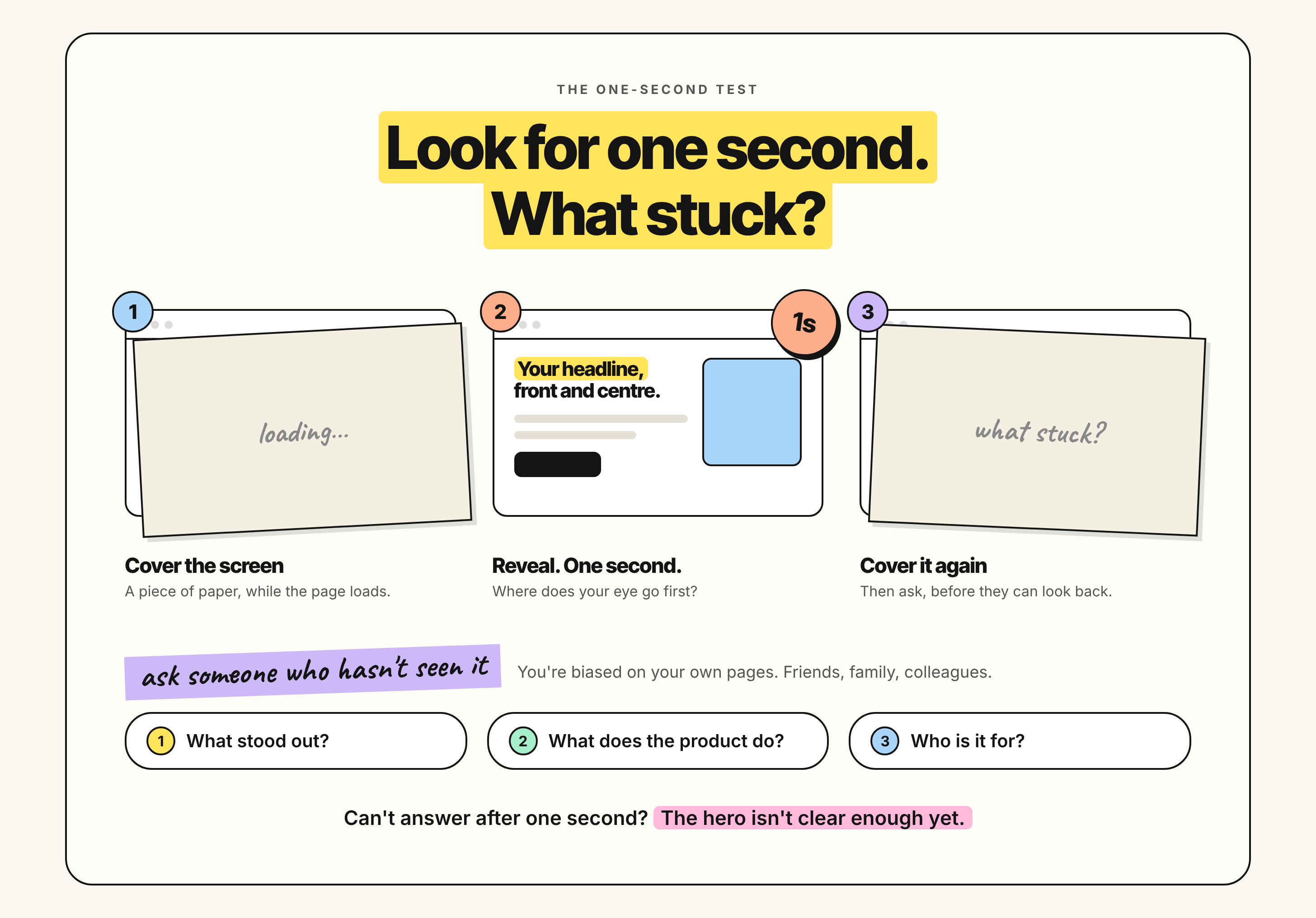
Pull up your landing page and cover the screen with a piece of paper. Once it’s loaded, take the paper away, look for one second, then cover it again.
What stood out? Do you remember the headline? Where did your eye go first?
You’re biased on your own pages, so get other people to do it. Friends, family, colleagues, anyone who hasn’t seen it.
Then ask them three things: what stood out, what do you think the product does, and who is it for.
If they can’t answer after one second, the hero isn’t clear enough yet.
Screen recordings
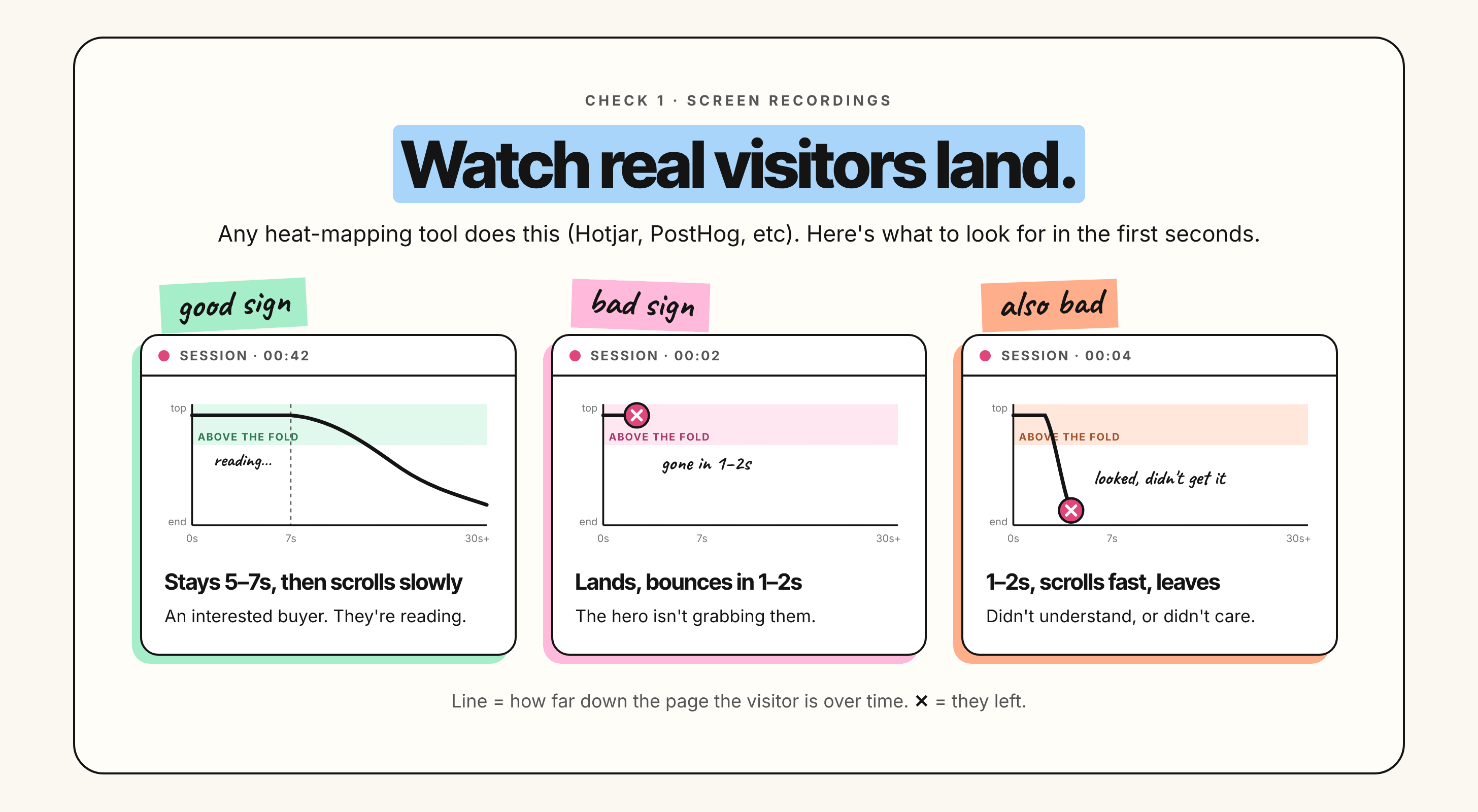
Any heat mapping tool will do this (Like Hotjar, PostHog, etc.) Watch real visitors land on the page.
Good sign. They stay above the fold for five to seven seconds, then scroll slowly. That’s an interested buyer. They’re reading.
Bad sign. They hit the page and bounce within one or two seconds. The hero isn’t grabbing them.
Also bad. They stay one or two seconds, scroll fast, then leave. They looked, didn’t understand or didn’t care, and went.
Scrollmaps
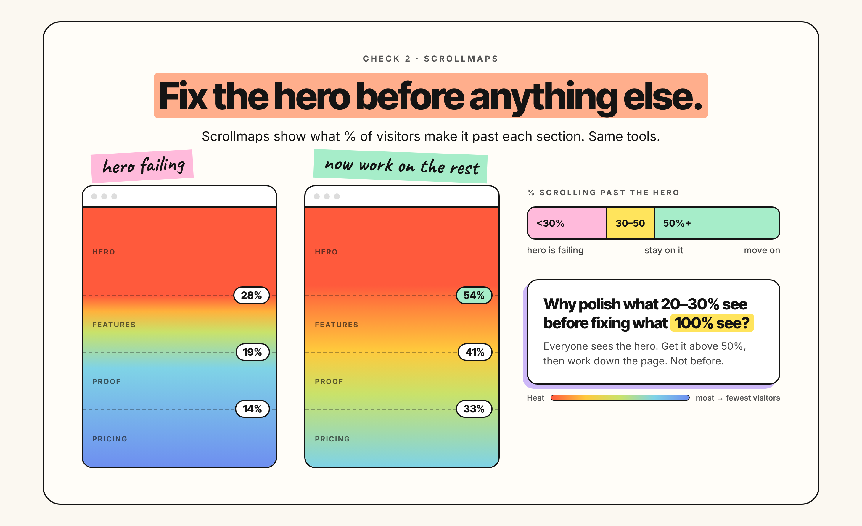
These show what percentage of visitors make it past each section. Same tools.
If fewer than 30% scroll past your hero, the hero is failing.
Stay on it until you’re above 50%.
And here’s why this ordering matters. Why optimise what 20 to 30% of visitors see when you haven’t fixed the section 100% of them see?
Get above 50% scrolling past the hero. Then go and work on the rest of the page. Not before.
What most people do instead
They tweak button colours. They A/B test body copy. They add another feature block halfway down.
All of which is work on the part of the page that fewer than a third of visitors ever reach.
Fix the hero first. Get 50% scrolling. Then everything else you do actually gets seen.
I hope you find this useful. Till next time ✌️
