


I audited 100+ landing pages
SaaS, ecommerce, agencies, B2B, B2C. All of it.
The pages that failed all made the same five mistakes. Not every page made all five, but most made three or four.
The ones that converted avoided all of them.
The patterns are so consistent I can usually tell what’s wrong in the first thirty seconds.
Most people assume the fix is optimisation..
Better design, more copy, more features. They keep adding and tweaking, hoping something clicks.
It’s almost always the opposite.
The pages that convert aren’t the most impressive. They’re the simplest. Clear headline, obvious outcome, easy to read, fast to load.
The ones that fail are trying too hard.
Here are the 5 mistakes
In the order they cost you the most.
1. A weak first impression
The most common one by a distance. Most of the pages I audited failed here before anything else got a chance.
This is your first impression and it needs more thought than anything else on the page. You have to hook visitors to get them scrolling and investigating.
One good hook is worth more than thousands of words of masterful copy.
Your headline is the thing that gets seen more than anything else. Get everything else right and the headline wrong, and the page is dead on arrival.
If you had a one dollar budget, spend 80 cents on the headline.
Because you get one shot when someone lands. You have their attention for a few seconds. And plenty of other people are competing for those seconds.
The fix: the 4 Us.
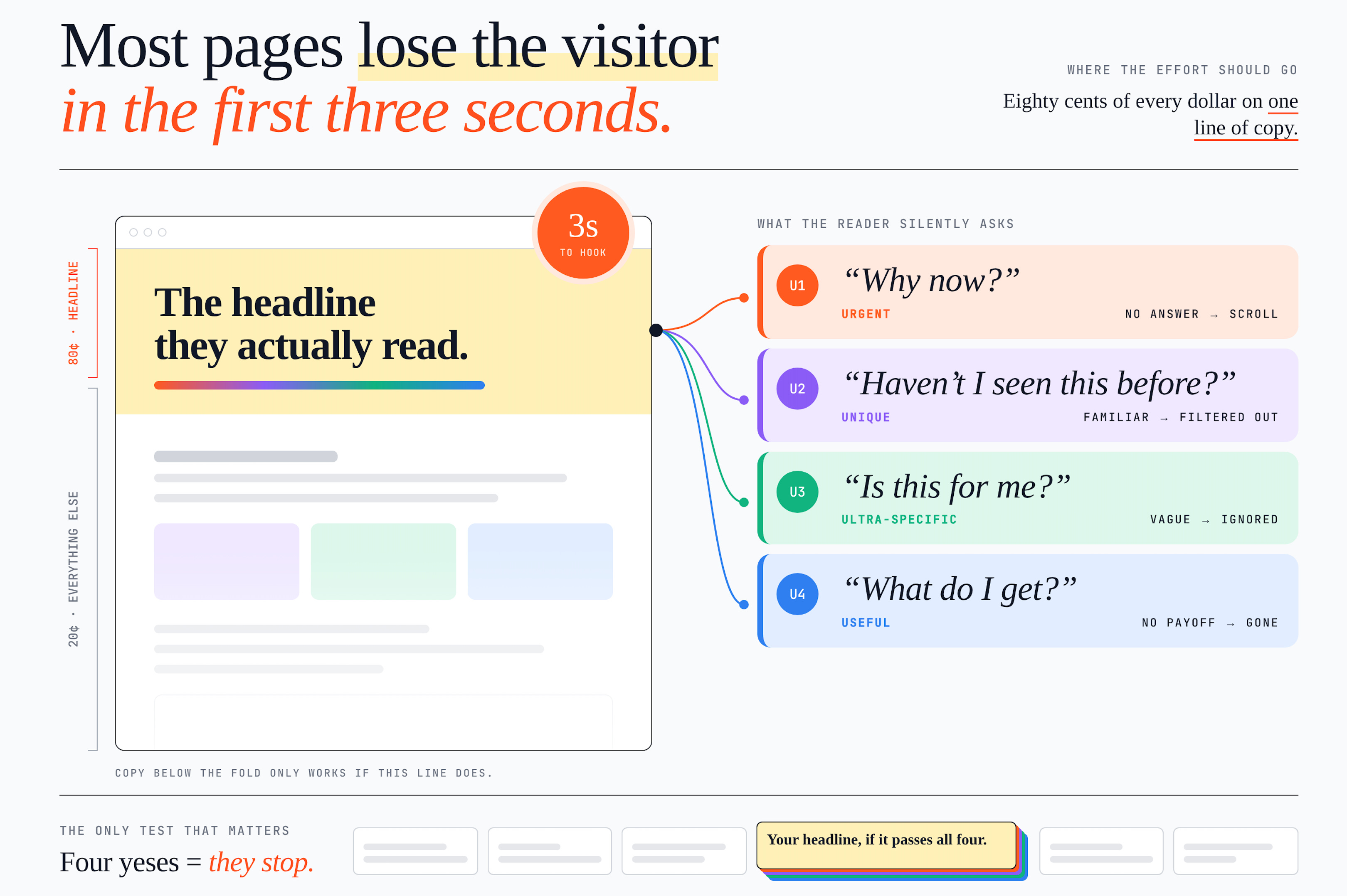
Not as a checklist. As four questions your reader asks without realising it.
Urgent. Why should I pay attention right now? No urgency, they scroll.
Unique. What makes this different from the last ten things I’ve seen? If it feels familiar, their brain filters it out.
Ultra-specific. Who is this for, and what exact problem does it solve? Vague headlines get ignored. Specific ones feel personal.
Useful. If I give you my attention, what do I get? How does my situation improve?
If your headline doesn’t answer all four, it isn’t strong enough yet.
Would you stop scrolling for it? If not, rewrite it.
2. Clever instead of clear
This one kills pages that should convert.
80% of copywriting is knowing what to say. The other 20% is how you say it.
You land on the page and think, okay, but what is this?
If someone can’t work out what you do, who it’s for, and why it matters within five seconds, you’ve lost them.
Clarity beats cleverness every time. Even sophisticated audiences want things presented simply.
Steve Jobs - he took genuinely complex ideas and boiled them into language anyone could follow.
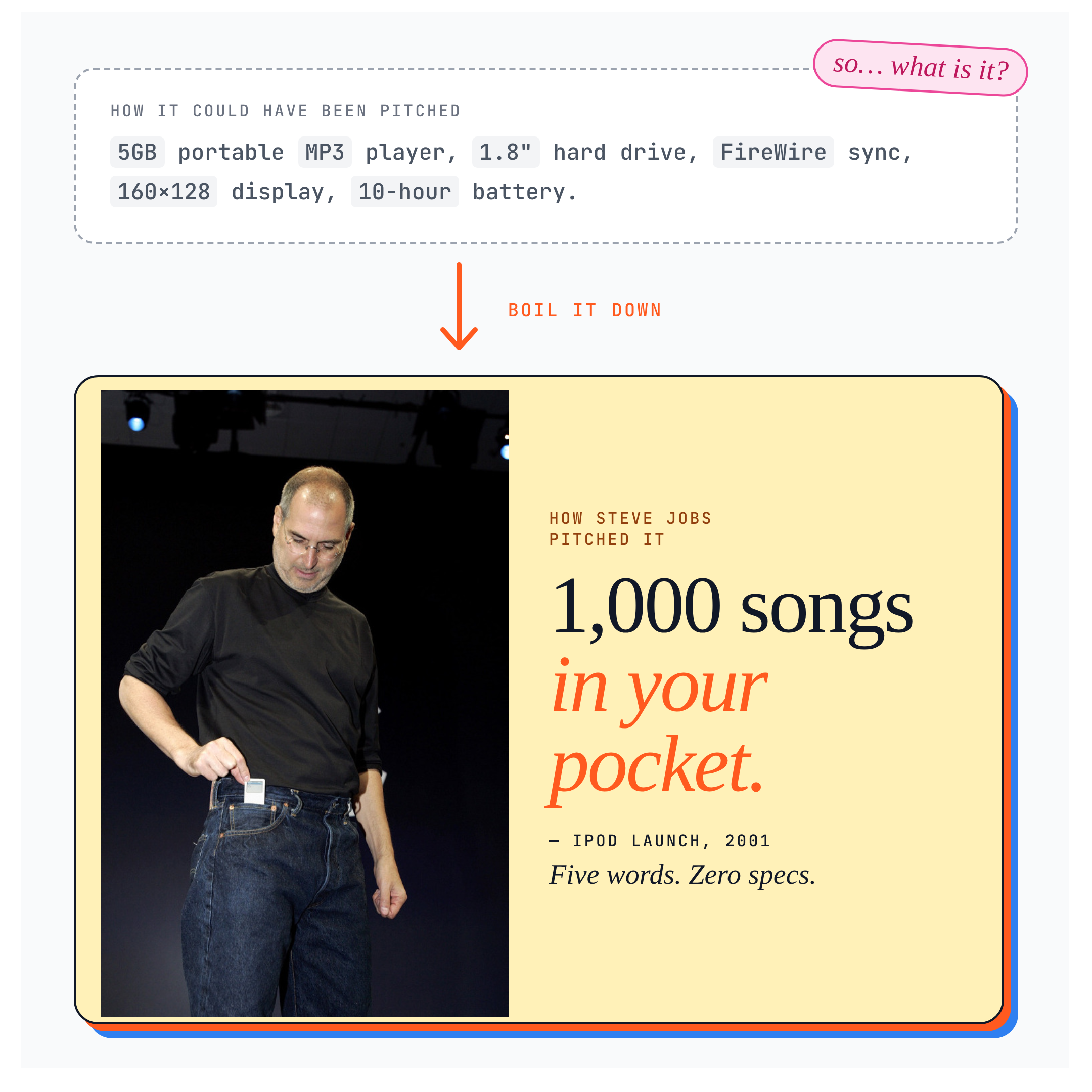
The fix: make the outcome obvious.
The pages that convert aren’t dumbing anything down. They’re doing the harder thing, which is taking something complex and making it feel obvious.
Start with why people actually buy. Not solutions. Not products. Outcomes and certainty.
In B2B it’s one of four things. Increase revenue, through new customers, bigger deals or higher prices. Save money, by cutting costs or doing more with less. Save time, through automation or a shorter path. Mitigate risk, by avoiding mistakes, staying compliant or reducing churn.
In B2C it’s one of three. Health: look better, feel better, live longer. Wealth: earn more, keep more, spend smarter. Relationships: love, status, belonging, connection.
Pick the one you’re actually selling and lead with it.
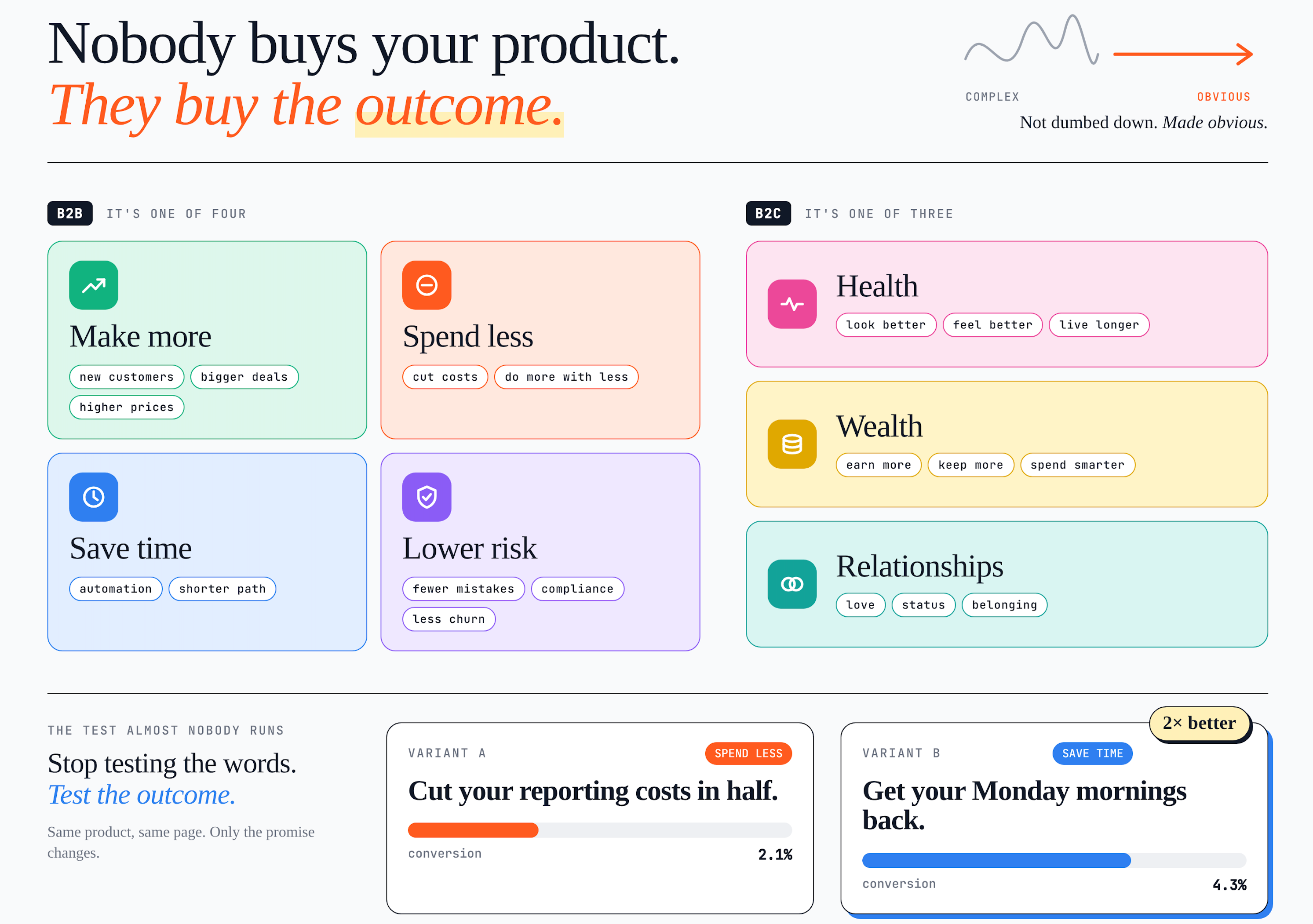
And here’s something most people never test. Everyone A/B tests headlines. Almost nobody tests the outcome they’re leading with.
Try swapping it. You might find “save time” converts twice as well as “save money” for your audience, and no amount of rewording the headline would have told you that.
3. Hard to read
There’s nothing more daunting than a wall of text that makes someone think, I have to consume all of this.

Most people skim. Rather than fighting that or pretending otherwise, build for it.
Short and sharp sentences. Use a mix of lengths. Shorter ones to hammer home the key points, occasionally longer ones for variety.
Feed people information in three or four words per sentence and each one becomes bite-sized, easy to digest, and pulls them through.
On landing pages that usually means a few lines of text followed by bullets.Easy on the eye. I keep my copy simple with black text on a white background. The high contrast lets your eyes move across the page without effort, which makes it easier to follow and absorb.
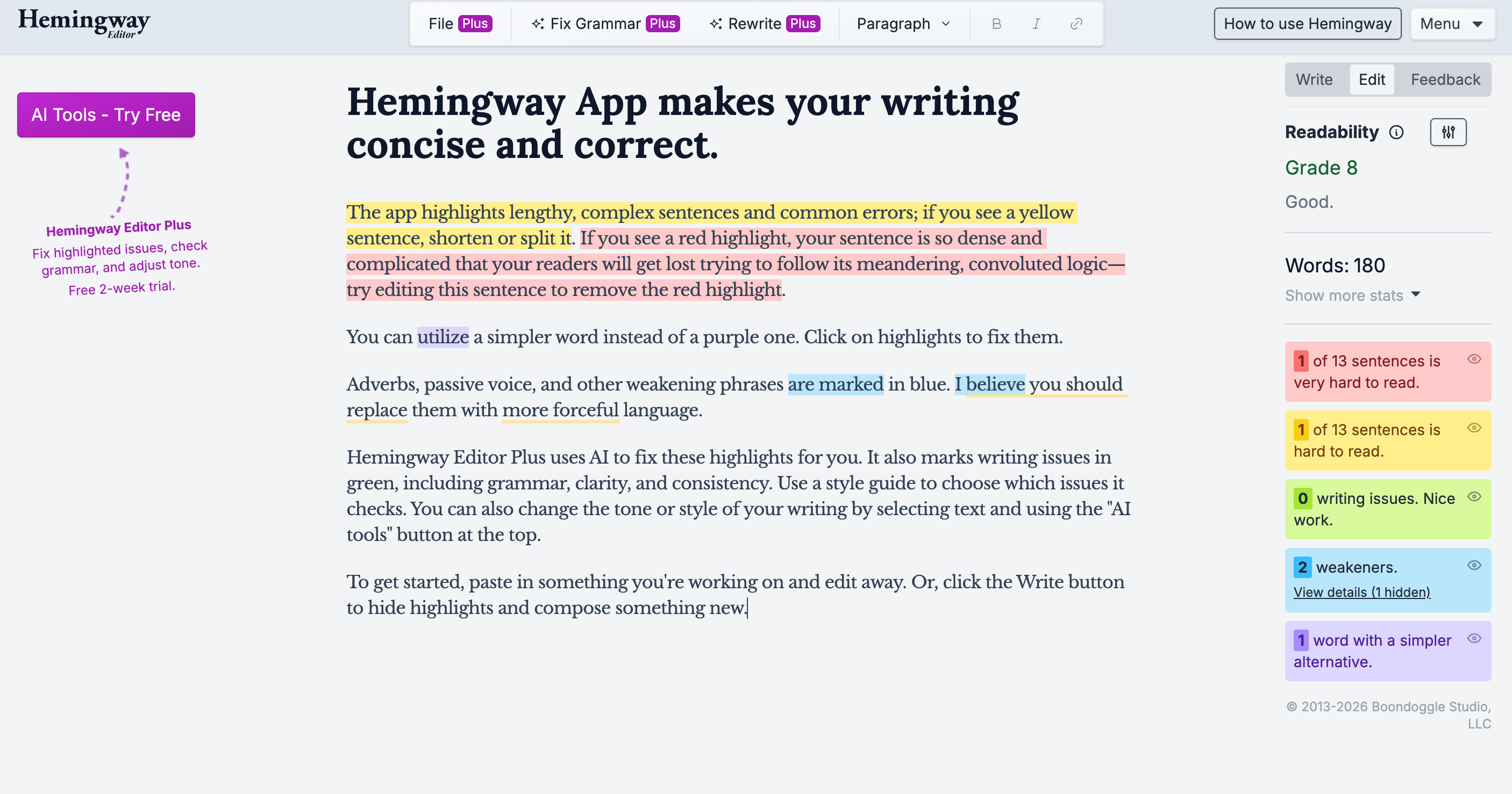
That isn’t about aesthetics. It’s about readability, and it’s directly driven my conversions.Run it through Hemingway. Free, and it highlights whatever is hard to understand or overly complex. I aim for a 5th-grade reading level or lower.
Edit ruthlessly. Most of the work happens here. Once the copy exists, 80% of the time you spend getting it to something you’d actually publish happens at the end.
And it’s about cutting back everything that doesn’t move the storyline forward. Claude is good for this if you ask it what to remove rather than what to add.
4. Bad design
Gone are the days when you could get away with an ugly landing page, especially now.
First impressions last, and people decide whether to trust you long before they read anything properly.
Go to saaslanding page.com

Pick one that you like and copy the link. Paste the link to Claude (or whatever LLM you prefer), upload your copy and images from your current website - use this prompt :
I like the design and layout of this website: [paste link]. Use it as inspiration to create a polished landing page for my project, using the images I’ve uploaded. Capture a similar overall feel, but don’t copy the site or reproduce it exactly.

Before you start, ask me any questions you need about the page’s purpose, audience, content, or style.
Get into the habit of building a swipe file of landing pages.
If you don’t have one you’re making life harder than it needs to be.
Think of it as your personal vault. Sites that made you pause, click, or think damn, that’s good. Screenshot them. Save them. Google Drive, Notion, a folder on your desktop, doesn’t matter.
Good marketers are obsessive savers.
If you’re not actively looking at the best landing pages, you’re missing the patterns.
My shortcut for this is saaslandingpage.com. These are companies spending millions on their sites.
You’re borrowing the output of millions in testing and ad spend, for nothing.
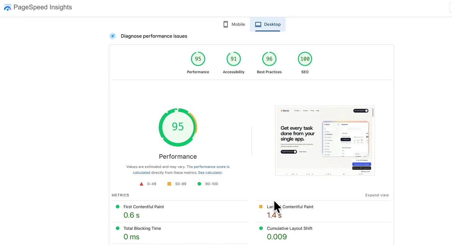
5. Too slow
You could have the best page in the world. If it doesn’t load, you’re toast.
People expect three seconds or less. Longer than that and they leave before they’ve seen anything you wrote.
The fix. Framer is already optimised for this. Keep images and gifs under 1MB. Host video on Wistia or Vimeo and link to it rather than uploading directly.
Then run it through Google PageSpeed Insights before you call it finished.
Apple didn’t get there by adding
When people think about Apple they think about simplicity. Not specs. Not features.
That didn’t come from taste. It came from discipline.
Steve Jobs was famous for killing things. Entire features, entire products, entire directions. Not because they were bad, but because clarity only happens when you remove everything that doesn’t matter.
That’s why Apple products feel easy. They don’t overwhelm you. They guide you.
Winning landing pages do the same thing. They don’t try to impress. They guide.
Go and check yours
That’s the five.
Fix three of them and the page will improve. Fix all five and you’ve removed almost everything that was stopping people.
The pattern across every audit I’ve done is the same: the failing pages weren’t missing anything. They had too much.
Clear headline. Obvious outcome. Easy to read. Fast to load.
That’s the whole list.
I hope you find this useful. Till next time ✌️
