


In 1948, the McDonald brothers had a problem
Their restaurant was popular, but slow.
And every time they tried to speed things up, quality suffered.
So they did something strange.
They studied assembly lines from car manufacturing. They redesigned the entire kitchen.
They specialised every role, so one person grilled, one person dressed, one person finished the burger.
They pre-portioned every ingredient and choreographed every movement.
They called it the Speedy System.
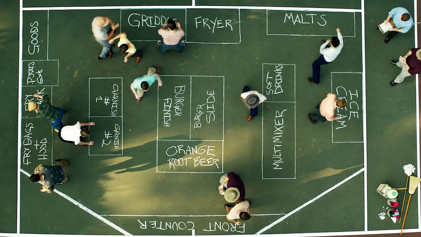
The result was a burger in 30 seconds. Faster than any competitor, and better quality than they’d ever managed before.
They didn’t work harder. They redesigned the process.
Landing pages have the same problem
Creating a high-converting one takes a lot of work.
Hours of writing copy, tweaking design, second-guessing everything.
And when you finally launch, the conversion rate is below average anyway.
So you try AI to speed it up. Now your page looks like every other AI-generated page.
Generic copy, corporate jargon, cookie-cutter design.
Most people think you have to choose. Spend days crafting the perfect page, or use AI and accept that it looks like everyone else’s.
Quality takes time. Speed sacrifices quality. You can’t have both.
Except speed and quality aren’t opposites when you’ve got the right system.
I’ve built over 100+ websites in the last ten years, and the pattern is always the same: the best landing pages don’t overwhelm; they guide.
They follow a structure.
One framework. Three tools. Under two hours from concept to published page.
The framework: five sections
A landing page is the first step in a funnel. A system with inputs, processing and outputs. The input is attention, the processing is persuasion, the output is revenue.
Most landing pages fail because they bury the value proposition or confuse the visitor. They try to say everything at once. They overwhelm instead of guide.
Five sections fix that.
1. Hero hook
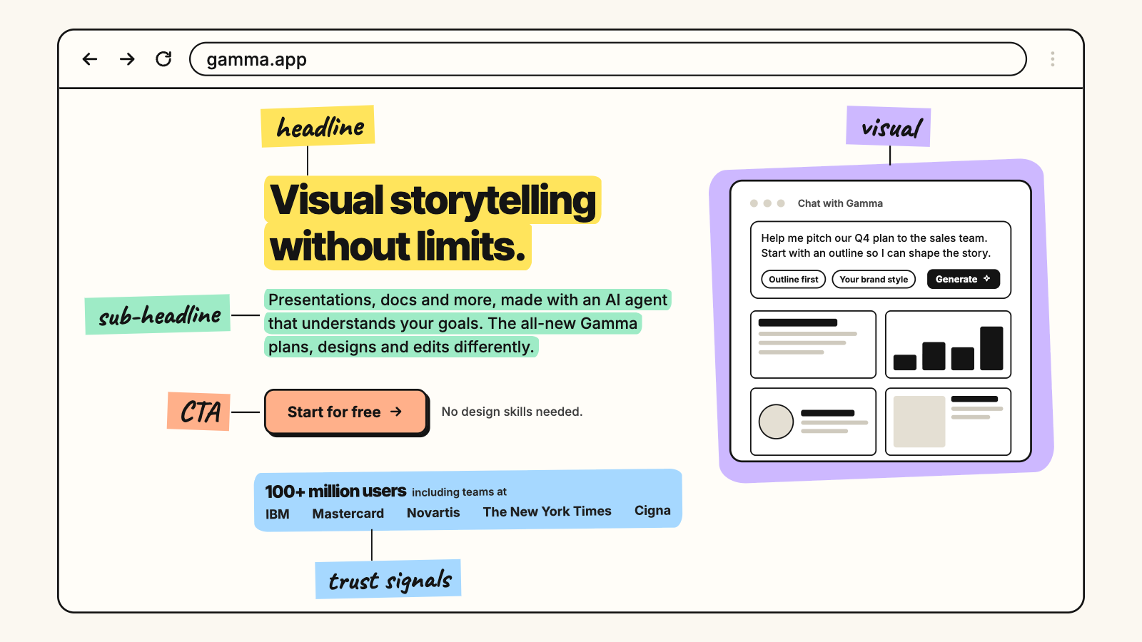
Your first impression. Hook visitors immediately so they keep scrolling.
If you had a one dollar budget, spend 80 cents on the headline.
Headline. Your boldest claim or most attractive benefit, tailored to your audience. Its job is to grab attention, spark intrigue and promise something specific. I use the 4 Us: urgent, unique, useful, ultra-specific.
Sub-headline. Elaborate on the headline and lead into the CTA.
Visuals. Show the product in action. Image, gif or video.
CTA. A concise incentive, with trust-building elements like recognisable customer logos.
One good hook is worth more than a thousand words of masterful copy. If you can’t hook someone’s attention, the rest of your copy doesn’t matter, however strong it is.
2. Old way
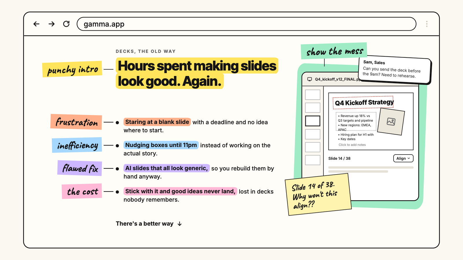
Your market is stuck with problems your product solves. Paint a vivid picture of that pain and expose the flaws in how they’re currently handling it.
Here’s where most people get it wrong. They nail the hero section and then jump straight to features. Here’s what our product does.
You need this section first. Agitate the pain before you offer the solution.
Skip it and your page reads like every other generic sales pitch. No empathy, no understanding, just buy our thing.
So: highlight the frustration and inefficiency they’re living with. Call out the shortcomings of the current approach. Show what happens if they stick with the status quo.
Start with a punchy intro summing up their struggle, then bullets to drive it home. Direct, easy to skim, and it gets them thinking I need a better way.
3. New way
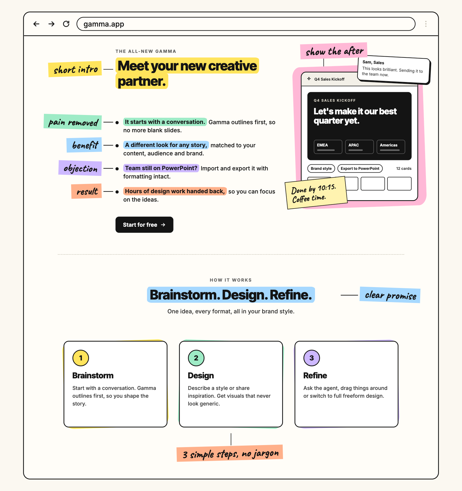
The meat of the pitch.
Show how your solution eliminates the frustrations you just named, what the transformation looks like, and what measurable results they can expect.
Connect every feature to a clear benefit. Answer objections before they’re raised.
Short intro positioning your product as the answer, then bullets for the benefits and outcomes.
Then add an additional section below it to show how it works.
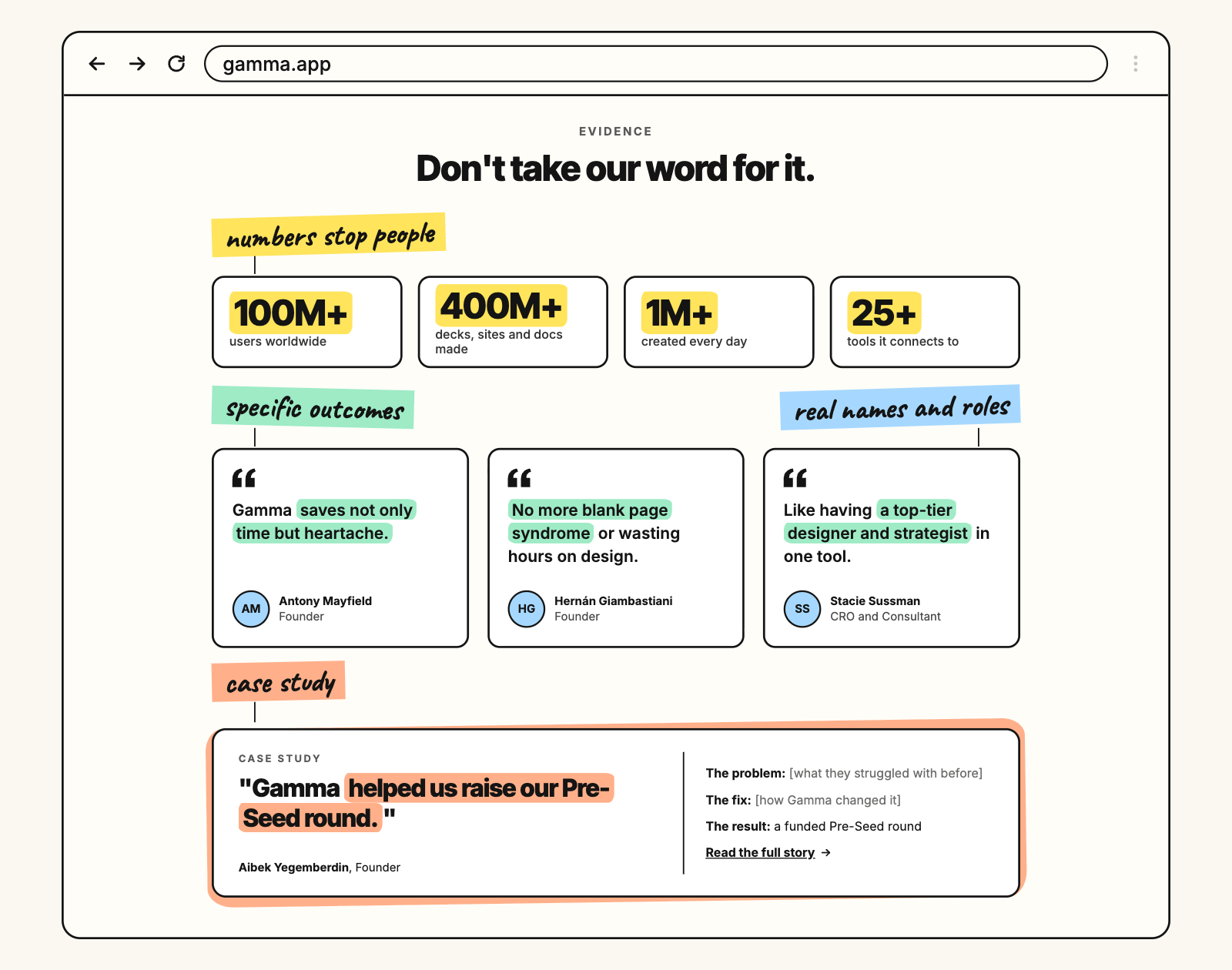
4. Evidence
Social proof is what makes any of it believable.
Reviews with specific outcomes, ideally from third-party platforms. Testimonials from happy customers or experts. Case studies showing real people who had the problem and don’t any more.
Numbers stop people. Readers skim, and a stat is what makes them pause. The more you can show, the better.
Without strong proof, people hesitate, and hesitation is where conversions go to die.
5. Call to action
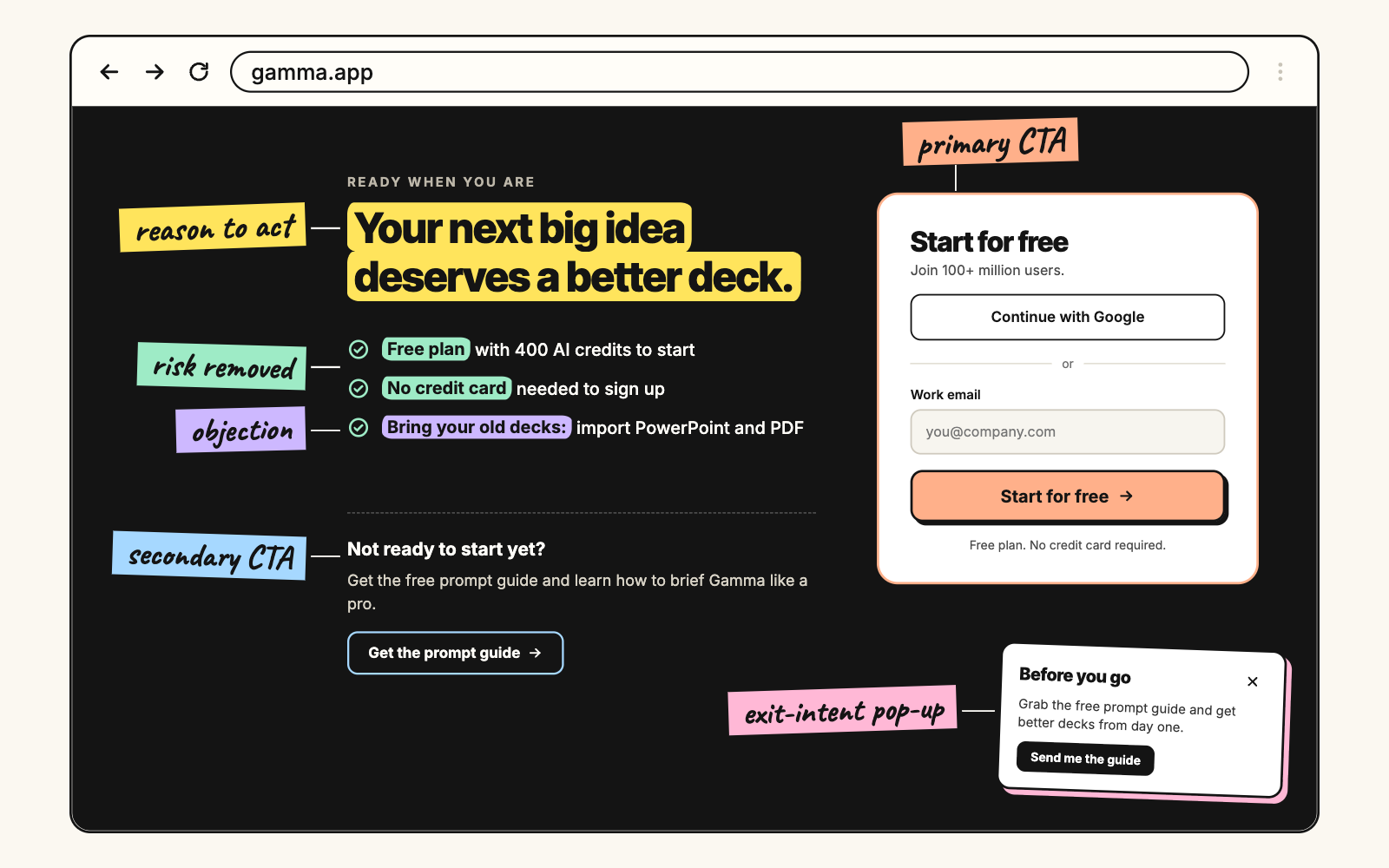
Deliver value without pressure or risk. Clear, straightforward, with a real reason to take the next step.
Primary CTA. Book a call, start a trial, buy. Address concerns upfront and reduce the risk with a free trial or a guarantee.
Secondary CTA. Not everyone’s ready, and that’s fine. Offer something low-pressure, an ebook, a guide, a mini course, that keeps them in the funnel.
And use exit-intent pop-ups to show the secondary CTA right before someone leaves.
That’s the framework. Five sections, forcing clarity, guiding the visitor from attention to action.
The three tools
The McDonald brothers didn’t make one person do everything. They specialised.
Same principle. You don’t need one AI tool that does everything badly. You need three, each doing one thing properly. Some examples of how I do it:
Framer for design
There are plenty of website builders. Framer is my favourite because it makes building almost effortless. Low-code, good for simple architectures, and optimised for speed.
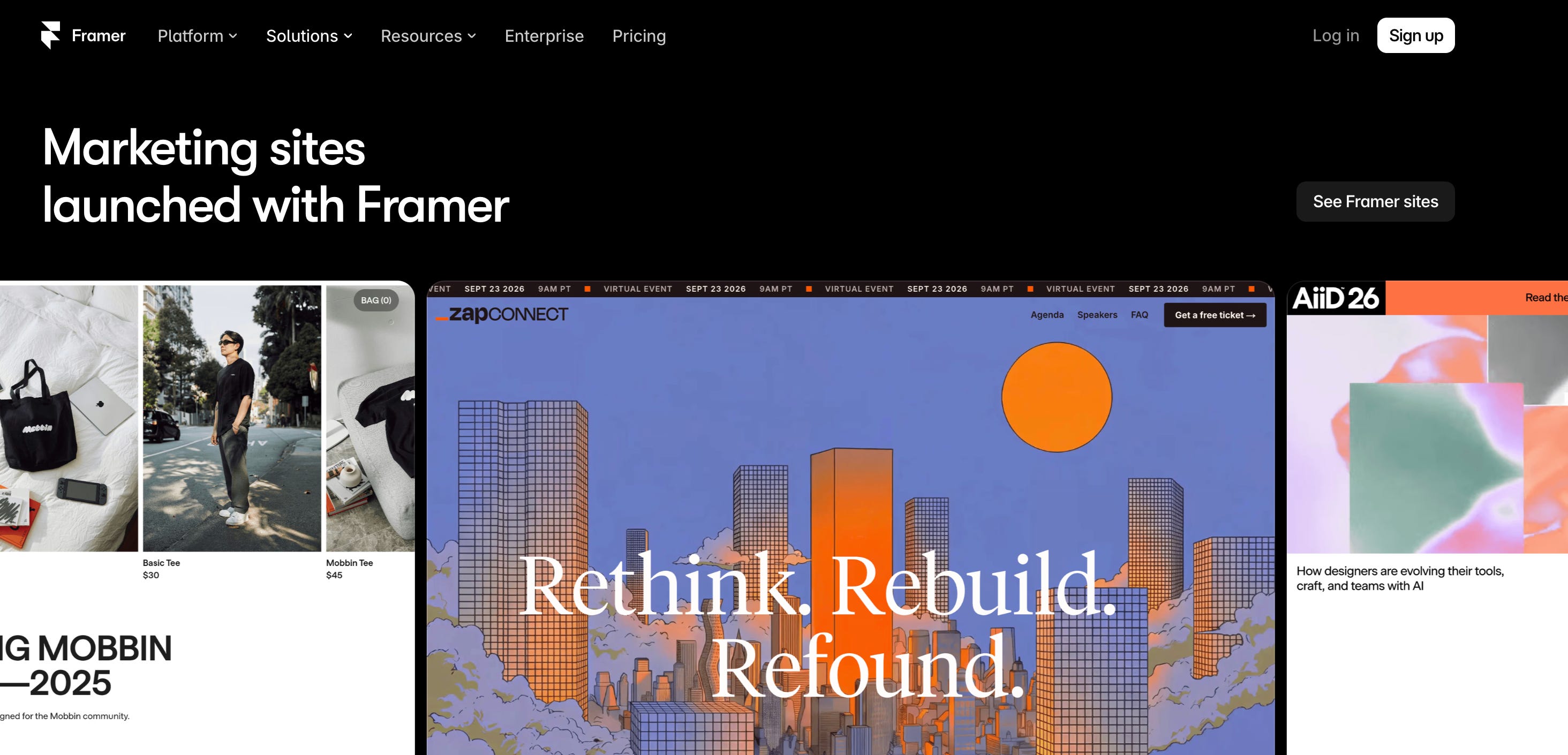
It’s got AI built in now with Agents, so you can design pages on the canvas, iterate, set breakpoints, add effects, create components, write code, connect the CMS and organise styles.
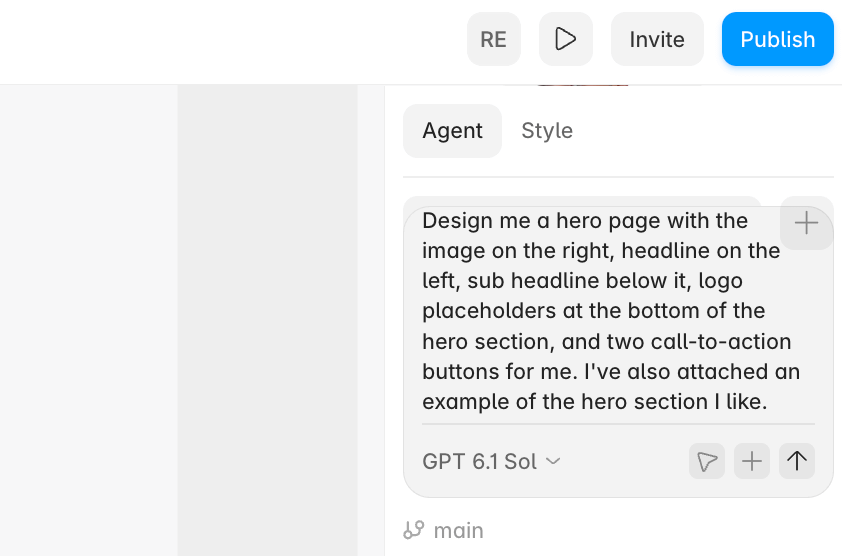
Go to the template library, pick one that matches your layout, customise it. You’re 80% done in 20 minutes.
Best practice: screenshot websites you like. Go to saslandingpage.com to get the best inspiration, screenshot it and click the plus button.
Claude for copy
This is where the framework comes to life.
You don’t tell it “write a landing page.” You give it the five sections and let it fill each one. Grab us promt:
You are an expert conversion copywriter.

We are {{COMPANY NAME}}, a {{TYPE OF BUSINESS / INDUSTRY}} that helps {{TARGET AUDIENCE}} achieve {{CORE DESIRED OUTCOME}}.

I want you to write a **high-converting landing page** following this 5-section structure:

1. **Hero (Hook & First Impression)**
   - Headline: Boldest claim or most attractive benefit.
   - Subheadline: Expand on the headline and lead naturally to the CTA.
   - Creative Visuals: Show the offer in action (e.g., image, gif, video).
   - CTA: One concise incentive + trust signals (logos, testimonials, guarantees).
   ⚡ *Your job: Hook them hard. If we lose them here, we lose them forever.*

2. **Old Way (The Pain)**
   - Agitate the pain points your audience is stuck with.
   - Expose the flaws of the outdated or inefficient methods.
   - Show the stakes of doing nothing.
   - Create urgency that makes them want change.

3. **New Way (The Solution)**
   - Show how the offer solves those pain points directly.
   - Connect features to tangible benefits and transformation.
   - Highlight measurable outcomes that align with their goals.
   - Make it easy to skim with punchy bullets and short, clear copy.

4. **Evidence (Proof)**
   - Add social proof: reviews, testimonials, stats, or case studies.
   - Highlight numbers or recognizable names to build trust fast.
   - Make it feel real, specific, and credible.

5. **CTA (Action)**
   - Primary CTA: high-intent action (e.g., book a call, buy, start free trial).
   - Secondary CTA: low-pressure option (e.g., guide, resource, waitlist).
   - Optionally include exit-intent CTA for last-chance conversion.
   - Make both CTAs clear, benefit-driven, and risk-reducing.

Offer Type: {{PRODUCT / SERVICE / LEAD MAGNET / ETC.}}
Target Persona: {{AUDIENCE / SEGMENT}}
Core Benefit: {{DESIRED OUTCOME}}
Tone of Voice: {{TONE — bold, clear, benefit-driven}}
Primary CTA: {{ACTION — e.g., Book a Call}}
Secondary CTA (Optional): {{ACTION — e.g., Download Guide}}
Proof Elements: {{TESTIMONIAL / STAT / LOGOS}}

Before writing, ask me 3–5 questions to clarify offer positioning, pain points, proof, and CTA strategy.
What comes back is structured copy that follows the framework. Not generic AI copy, because you’ve given it a structure to work inside rather than asking it to invent one.
An LLM for images
Plenty of tools do this now. I use ChatGPT, because it’s the most accurate for what I actually want, and Gemini. Higgsfield AI is good for inspiration.
What I tend to do: go to saaslandingpage.com, screenshot every image I like, upload them and ask for something similar in theme without copying.
90% of media buying doesn’t matter if your creative is bad. Same applies here. You need a pattern interrupt, something that breaks the visitor’s flow. The visual hook, or the scroll stopper.
Before reaching for AI, try your actual product screenshots or photos of yourself. Authenticity beats generated every time.
And here’s the mistake. People generate one image, use it, and call it done.
Generate 5 to 10 variations. Different styles, compositions, colour schemes. Then pick the one that actually stops the scroll.
AI gives you speed. You still have to supply the judgment.
So: Framer builds the structure, Claude writes the copy, an LLM makes the visuals. Each tool doing one thing properly.
Quality control
You’ve got the framework and the tools, and you’ve built the page in under two hours.
This is where most people stop, and it’s where the page gets made or lost.
Readability
Consumption precedes conversion. There’s no point having a landing page if nobody gets through the copy.
Run it through the Hemingway Editor. It’s free, and it highlights whatever is hard to understand or overly complex.
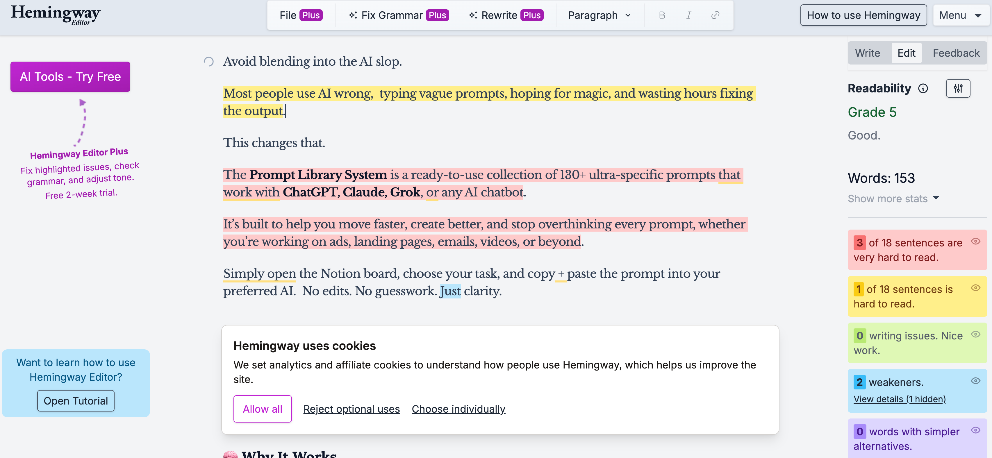
I aim for a 5th-grade reading level or lower. That isn’t dumbing it down, it’s being clear. If your copy is complex, people bounce.
Design inspiration
saaslandingpage.com again, and this is the part I’d actually call a secret weapon.
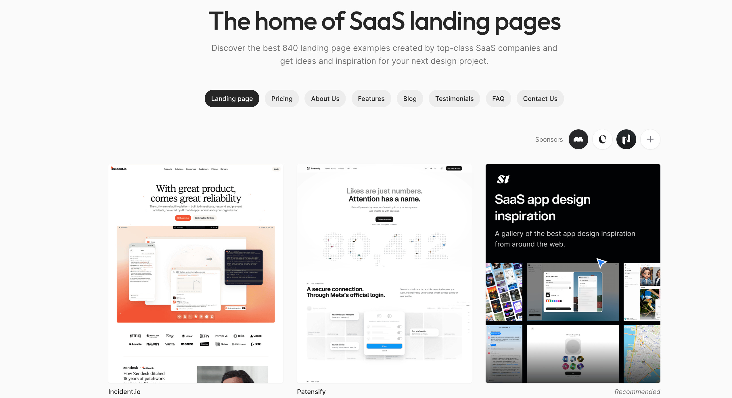
These are companies spending millions on their sites. Look at how they structure hero sections, where they put social proof, how they position CTAs.
Not to copy them. To study what works. You’re borrowing the output of millions in testing and ad spend for free, and with Framer you can get close to that design quality in an afternoon.
Page speed
Fitting, given the Speedy System.
People expect a page to load in three seconds or less. Longer than that and they bounce. You can have the best page in the world and it won’t matter.
Framer is optimised for this already. Keep images and gifs under 1MB. Host video on Wistia or Vimeo rather than uploading it directly.
Then run it through Google PageSpeed Insights before you call it done.
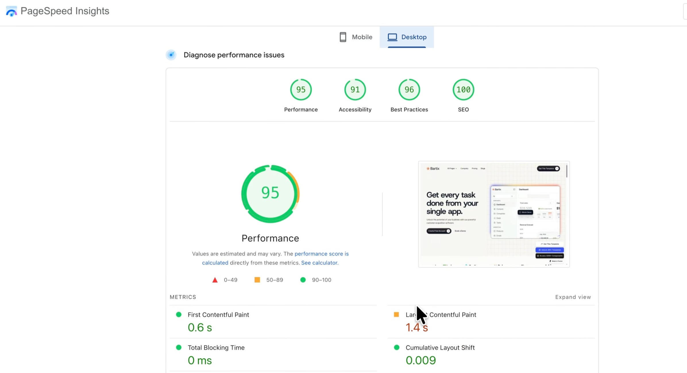
What the difference actually looks like
Ask AI for “a landing page” and you get a headline like “The Best Solution for Your Business,” copy about leveraging cutting-edge technology, and no structure underneath any of it.
Use the five sections and you get a headline built on the 4 Us, copy that moves from pain to solution to proof to action, and a human voice.
One of those looks like every other AI page. The other looks like someone made it on purpose.
What to do with this
The McDonald brothers redesigned their kitchen to make a burger in 30 seconds.
This is the same move, applied to something that currently eats your week.
Open Framer, pick a template, spend thirty minutes filling in the five sections with Claude. You’ll have 80% of a landing page done before lunch.
Till next time,
Rachid